Matti Klenell on the Nationalmuseum reopening
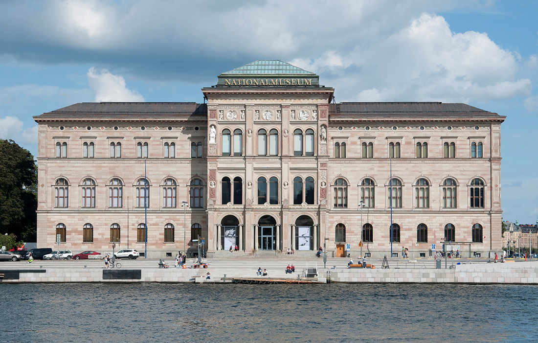
Nationalmuseum opts for contemporary furnishing and artistic decor in the museum’s new restaurant. Matti Klenell, architect and artistic director, talks about the work with the restaurant and the long Ateljé dining tables produced by Gärsnäs.
What was the assignment?
Quite simply to create Nationalmuseum’s new restaurant, bar and café. Based on our concept, some 80 new products have been made for what will be known as “NM& – A New Collection” produced by about 20 manufacturers.
What has been your role in Nationalmuseum’s renovation?
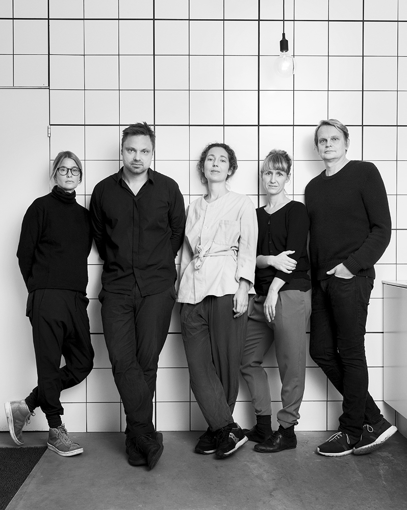
I was hired as the artistic director to assemble a group of designers to create the interiors for the new restaurant. So I asked Gabriella Gustafson and Mattias Ståhlbom, who run TAF Studio, Carina Seth Andersson and Stina Löfgren, because we had worked as a group before with good results. An early decision of ours was to design completely new objects to furnish the spaces. To realise this collection we have, in turn, invited another 27 designers to participate.

Is there a common theme for the work with the restaurant?
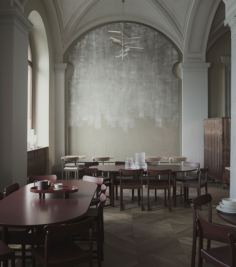
In a building filled with artistic masterpieces, we have focused on the process as we designed our interiors. The rooms reference how arts and crafts are made and we have tried to profile the materiality and colours under various degrees of treatment. We have also been inspired by workshops and artists’ studios as a creative space that everyone involved in the project can relate to. Perhaps it is most apparent in the dining hall where the classical artist studio has been a role model. The walls are covered with white-painted canvas, and here we see the extendable Ateljé tables and background walls with cabinets showing graphical prints. The art on the walls also reinforces the feeling of visiting a studio.

Among other things, you designed the Ateljé table that is produced by Gärsnäs. How does it harmonise with the rest of the decor?
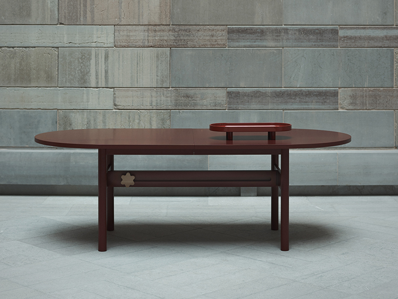
Inspiration for the Ateljé table came from imagining an artist’s worktable and is one of the elementary pieces of furniture in the dining hall, as well as the banquet rooms. The assignment was to create a table for both small and large groups. There was an express wish for a variety of table settings and to find a way around the room feeling either half-furnished or over-furnished. The Ateljé table provides flexibility at the very core of the product. Even when it is fully extended, the table is still robust. The idea is for Ateljé, just like all the other furniture in the restaurant, to serve for many years and age beautifully.
In brief, how would you describe the new restaurant as a whole?
The restaurant is located in what was previously the engraving hall and has a view of the palace. The windows have been opened up and the setting has everything you could wish for. Our aim was to create different spaces within the rooms through a variety of furnishing. In those minutes that it takes to wander through the 600 square metres of the restaurant, bar and café, the feeling and atmosphere change several times. You can liken it to a journey with several stops. Because the building and its rooms are strong and large and have a high ceiling, it has been possible to really go for it. The result is an interior with a high design factor.

Would you call it a milestone in the history of Swedish design?
It’s not up to me to decide. But it looks great and I think it will be popular.
What has been the greatest challenge?
Piecing together all the collaborations, not treading on anyone’s toes and maintaining a positive mood among everyone involved. I think we succeeded.
